Here are a few pointers to keep in mind while designing presentations for today’s audience
1. 3D graphics: Use of 3D rendering for images makes a world of difference when we present to an audience using a projector. The impact of a 3D image, like a logo, is far beyond that of standard 2D images. Designers should use Adobe Illustrator to convert 2D logos to 3D logos. There are also a few 3D image generators available online.

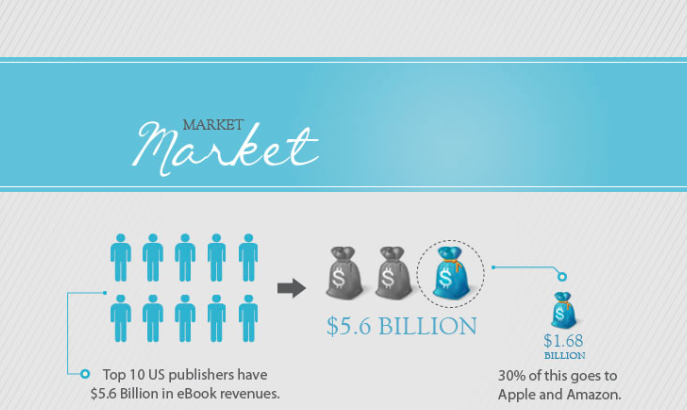
2. Infographics: Infographics can bring in a lot of creativity to the presentation design world. Slides that are extremely complex and have a lots of data (tables, charts, etc) can be beautifully expressed in infographics.

3. Modern Typefaces: The choice of font is critical in presentations. A bad font can be the difference between a ‘good’ presentation and a ‘great’ presentation. Typography has evolved to a great extent and modern fonts available today make presentations look stunning. So before you begin designing your presentation, take a moment to scan the plethora of fonts available today. Here are a few modern fonts that we love.
1. Fertigo Pro Typeface
2. Nadia Serif Typeface
3. Diavlo Typeface
4. Museo Typeface
5. Rezland Typeface
6. Nevis Typeface …. All these fonts are available on http://www.dafont.com/
4. HTML5: HTML5 can take your presentation to the cloud. PowerPoint transitions can are really tacky. HTML5 can make slide transitions look like a work of art. Designers must understand the intricacies of HTML5 before they begin to design presentations for the web.
A few sample HTML5 presentations created by us.


