An HTML5 presentation is a great alternative to a PowerPoint Slide Deck.
Now that we have a basic understanding of HTML5 Decks, here are 5 reasons why you must consider these presentations as an alternative to PowerPoint slide decks.
1.Presentation Grids
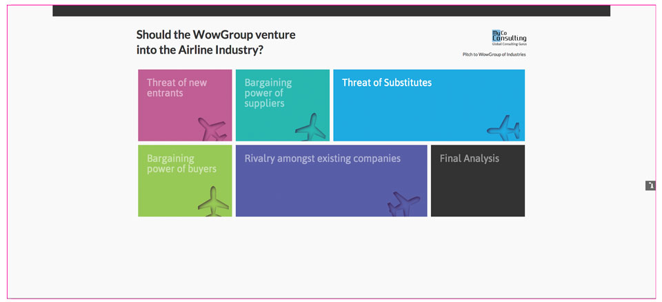
We encounter numerous presentations where the presenter has one main message that needs to be conveyed, but that message is broken down into several parts. If PowerPoint is used to deliver such a message, it would take up more than 10 or 20 slides. A Presentation Grid format offers a clever way to condense all these slides into a simple and effective interface. For example, we took a Porter’s Five Forces analysis PowerPoint that was more than 20 slides long, and converted it into this sleek looking HTML5 Web Deck. Click on the image below to view the pitch. Please note, the presentation contains dummy content and does not reflect actual data.

2.“Top X” Presentation Formats:
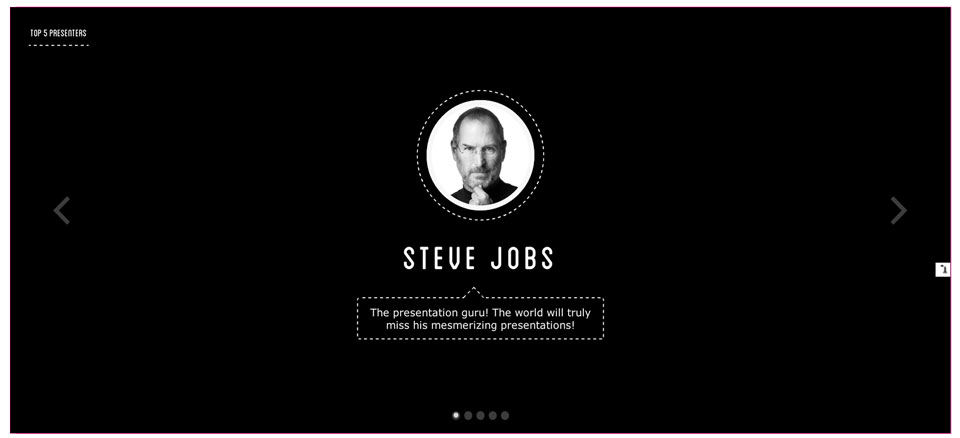
Many presenters use the “top X” approach to presenting (Top 10 mistakes, Top 10 qualities, Top 5 reasons, etc.). Our HTML5 Deck gives a unique twist to this style of presentation. Click the image below to view the pitch deck. Such quality is very difficult to replicate using PowerPoint.

3.Web Investor Update Presentation Format:
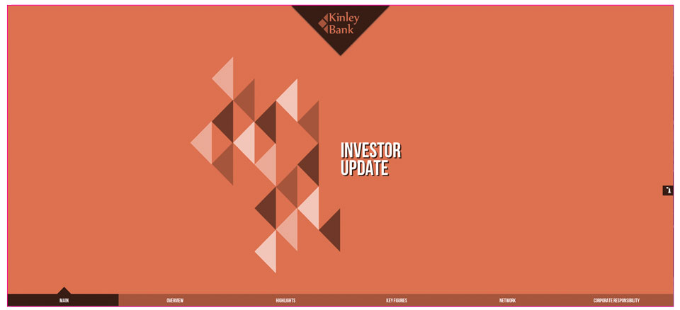
Lots of banks and financial institutions release investor updates. They are generally in either PowerPoint or PDF formats and tend to be extremely lengthy and unattractive. We created an HTML5 deck for this particular type of presentation and the end result can be seen below. The data used in the presentation is dummy content.

4.Multi-directional Navigation:
Web presentations make it easy to navigate through those text-heavy slides in a very user-friendly manner.

5.Timeline Slider Presentation Style:
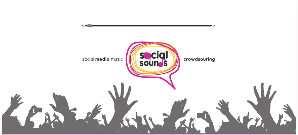
This is another important presentation format that can go horribly wrong when designed as a PowerPoint slide deck. A web version of a timeline slider creates a lasting impact.

